
#1
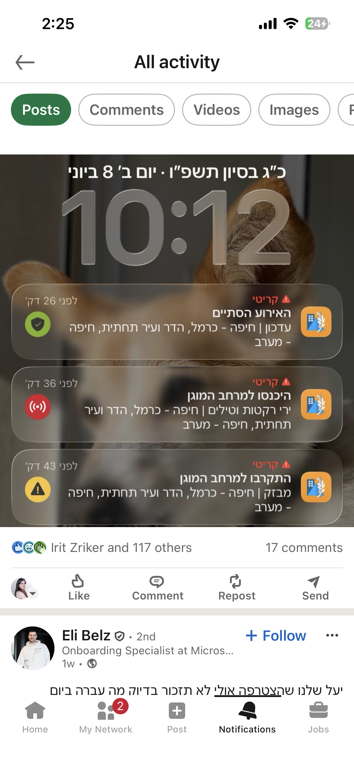
I couldn't tell if this alert was about me or a favorite area.
No distinction between act now and FYI.
It's 6:00 AM. Your phone screams.
You have 15 to 90 seconds to reach safety. You fumble for your phone, eyes heavy, heart already hammering. In that moment all you need is instant clarity: What do I do right now?That was the design challenge, and for too long the app hadn't been clear enough to solve it.
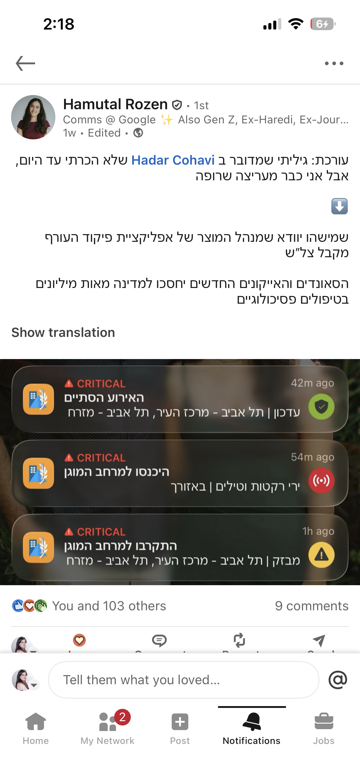
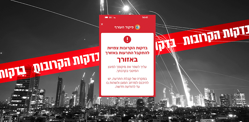
On June 8th, 2026, missiles from Iran and Yemen targeted Israel. Millions turned to their screens.
The redesigned app, which had launched just weeks earlier, faced its first true test.
Suddenly the conversation took an unexpected twist. The news wasn't just reporting on the attack, they were reporting the app’s new interface. Within hours, the redesign was trending across every major news outlet and social media platform in the country, recognized not only for its aesthetics, but for its life-saving utility.
“After the missiles from Iran and Iraq, many in Israel were exposed to the changes made to the Home Front Command app last month, each instruction now arrives with its own color and sound. What caught most users' attention was the new all-clear signal.”
Mako
Israel's largest digital news network
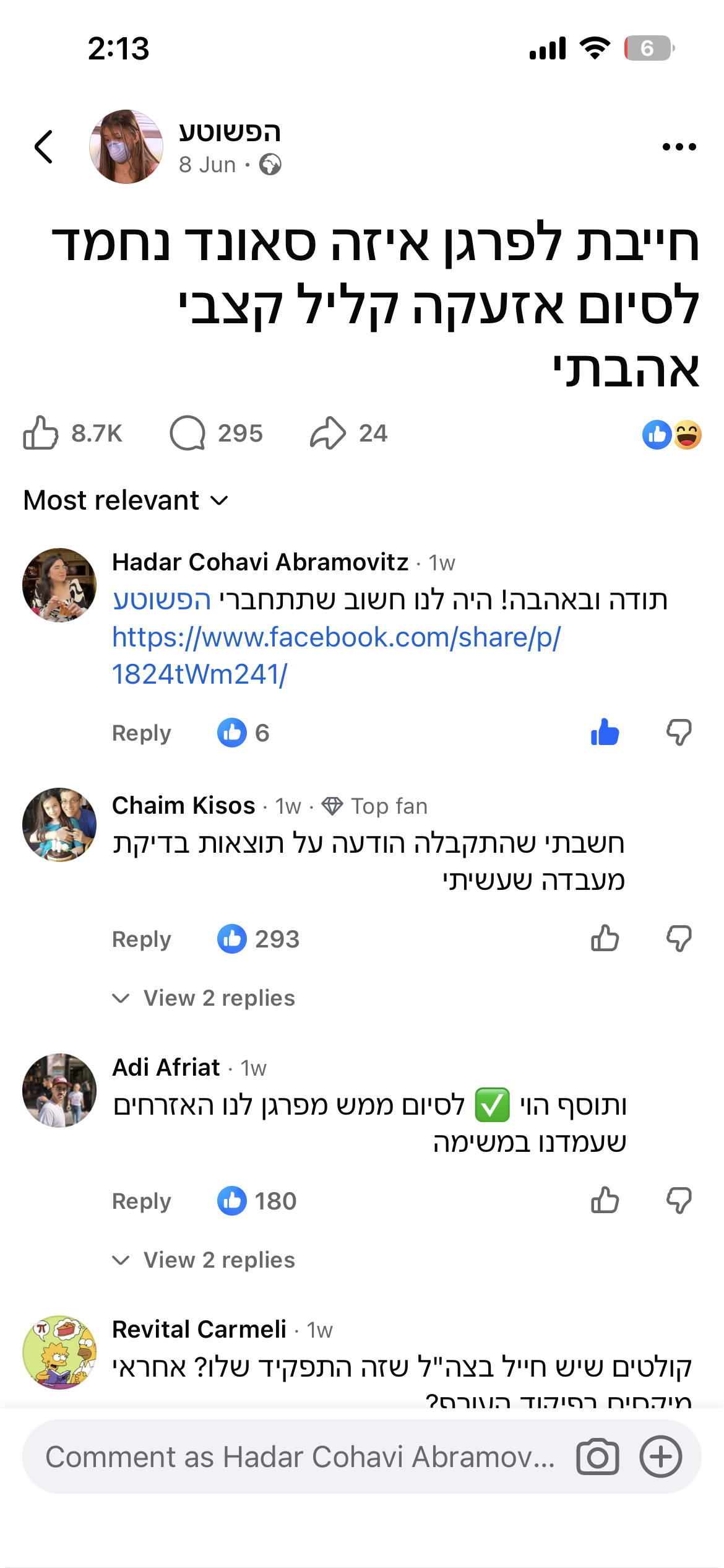
“The missiles fired at Israel in the past 24 hours led millions of citizens to their shelters, and exposed many of them to the Home Front Command app's new update for the first time. The new all-clear sound quickly became a topic of conversation across social media.”
Channel 14 (C14)
National broadcast
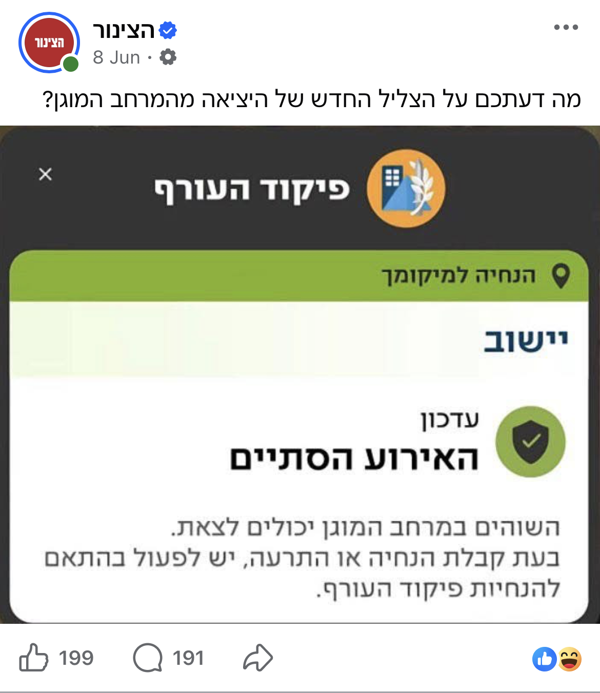
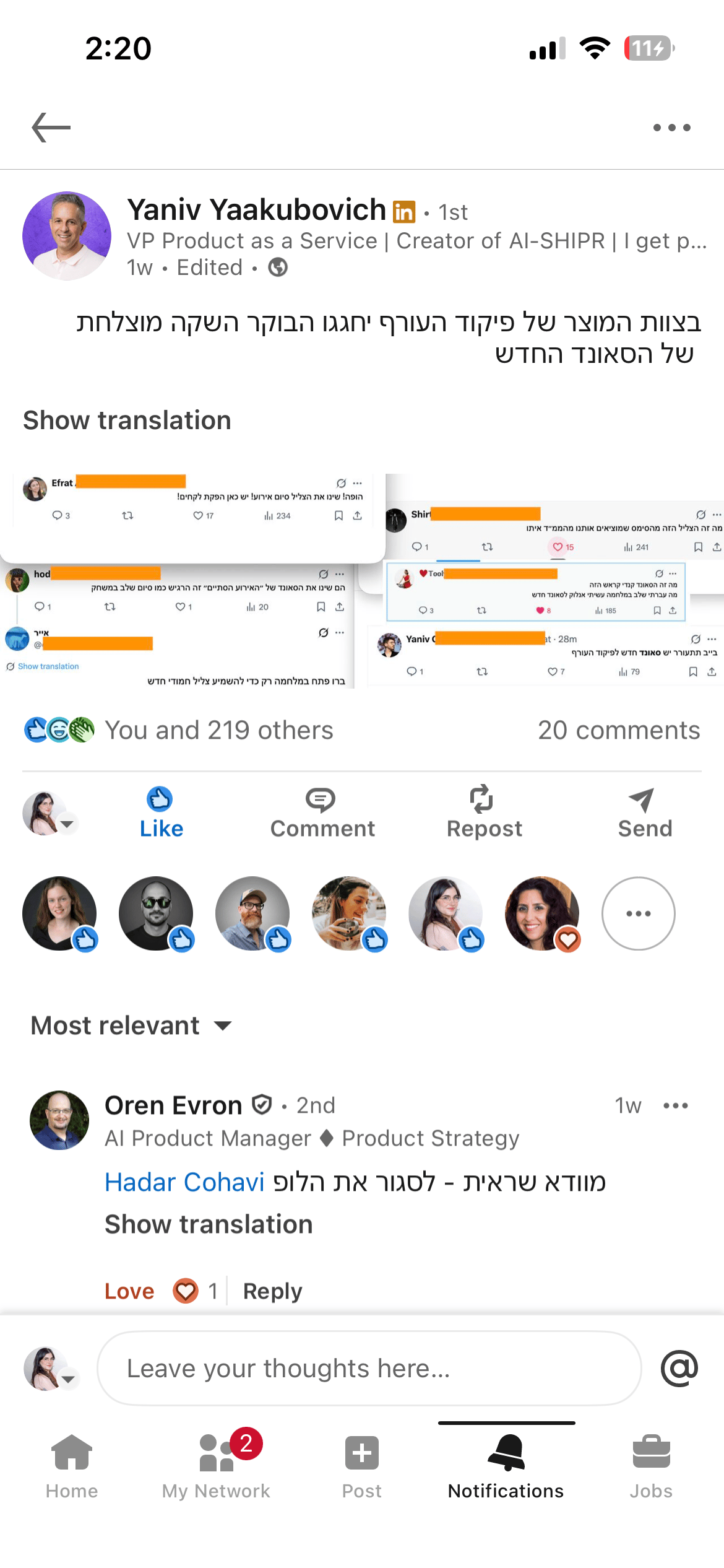
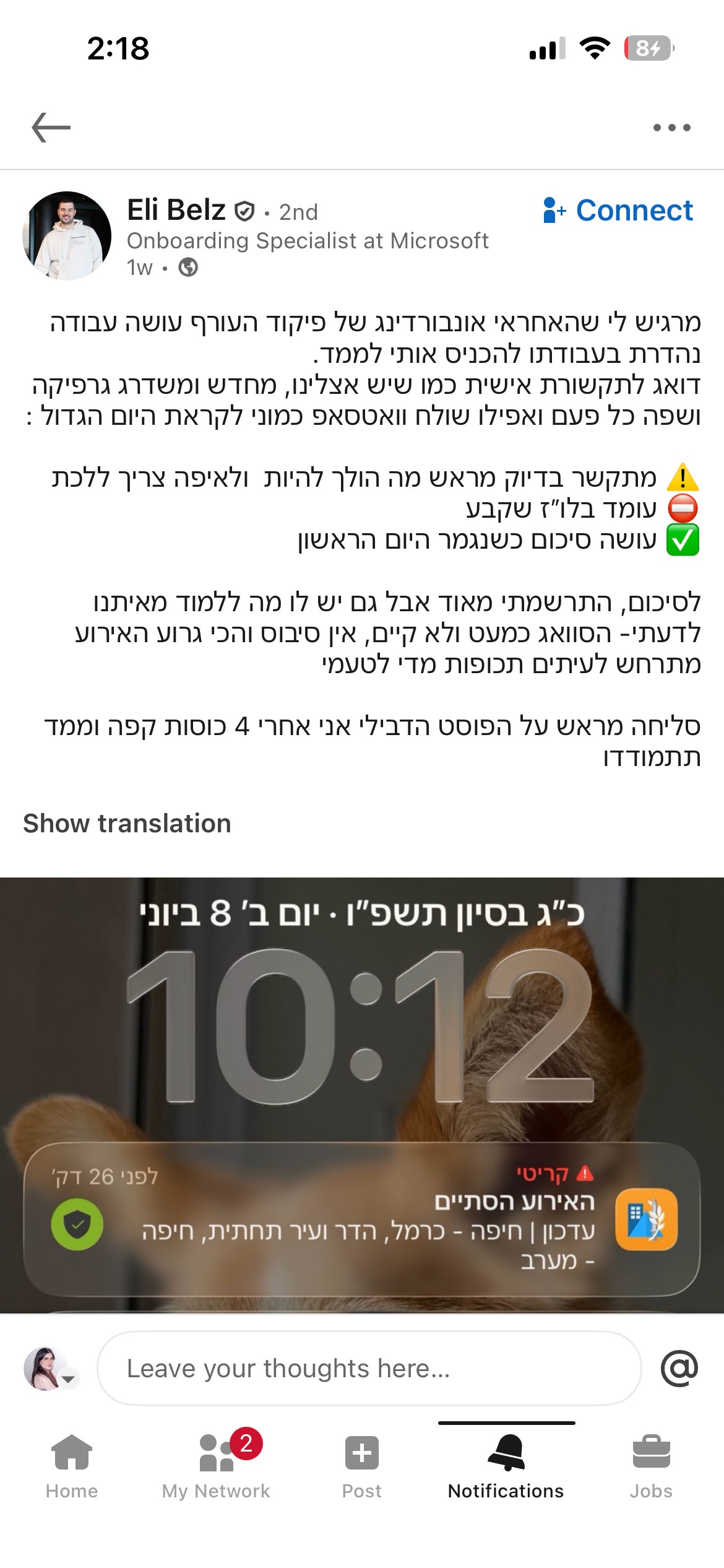
We weren't trying to go viral. We were trying to solve a problem. The reactions told us we'd gotten something right.
So why did it land?
The old app worked.
7M+ users, alerts went out, people went to shelters, lives were saved. But high usage in a mandatory-download app doesn't tell you much about the experience. People used it because they had to, not because it was effortless.
A mother who just got her baby to sleep, a religious person on Shabbat, a 9-year-old student during class. They are all opening the same interface, in the same window of seconds, in wildly different contexts.
Small UX friction that's invisible in everyday apps becomes consequential when seconds matter. For the first time, the design met users where they actually were.

THE RESEARCH
We didn't assume. We asked.
Before touching a single screen, I ran comprehensive user surveys and focus groups. Some findings confirmed our hypotheses. One genuinely surprised us.Four patterns surfaced across every user group:
No distinction between act now and FYI.
Those wasted seconds reading are seconds not spent moving toward safety.
Safe notification felt as alarming as the alert. Same sonic language. No emotional shift.
The notification and lock screen looked identical whether an alert was active or resolved.
Confirmed
Notification hierarchy confusion was universal. Threat-type clarity was hardest for older users and new immigrants.
Surprised us
The sound problem was physiological, not just UX. After a siren, the body is flooded with cortisol . The all-clear was registering as another threat signal, not a release. That single insight rewrote our approach to sound design entirely.
Shaped the whole project
The accessibility constraints were far wider than expected — Shabbat observance, hearing impairment, people driving, families sleeping in shelters for days. Not edge cases. Significant portions of the user base.
Looking across all four patterns, one theme emerged:
the app required reading. Reading creates friction, and friction isn't good enough.
Under stress, users needs quick certainty.
THE SOLUTIONS
What will reduce friction for this person, in this exact moment?
Every solution was born from that one question.
Before touching a single screen, we needed to address the reading friction at its root.
Is a picture worth a thousand words? Maybe. But in our case, it only needed to be worth 21, the average length of our previous notification. Knowing that visuals are processed faster than text, we built a comprehensive design system that lets users reach certainty before they read a single word, and when we used words, the cleanest terminology possible.
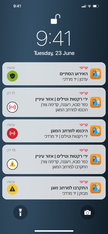
Each state received a dedicated color and sound to differentiate it.
All content was refined to the minimum.
Alerts are expected in the next few minutes. Find the best protection around. When receiving an alert, enter the protected space until further notice

Get closer to Protected Space
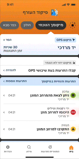
We created smart icons that combine an indication of both the threat type and whether it occurs within the user's location or a saved favorite location.
Your Location
Favorite Location
Earthquake


Tsunami


Unmanned aerial vehicle


Every color is paired with a dedicated icon and sound: three simultaneous signals that work independently. If your phone is face down, the sound tells you. If you're in a noisy environment, the color and icon tell you. No single channel has to carry all the weight.
We built this into a component library, reusable across every screen, every platform, every state, every future feature.
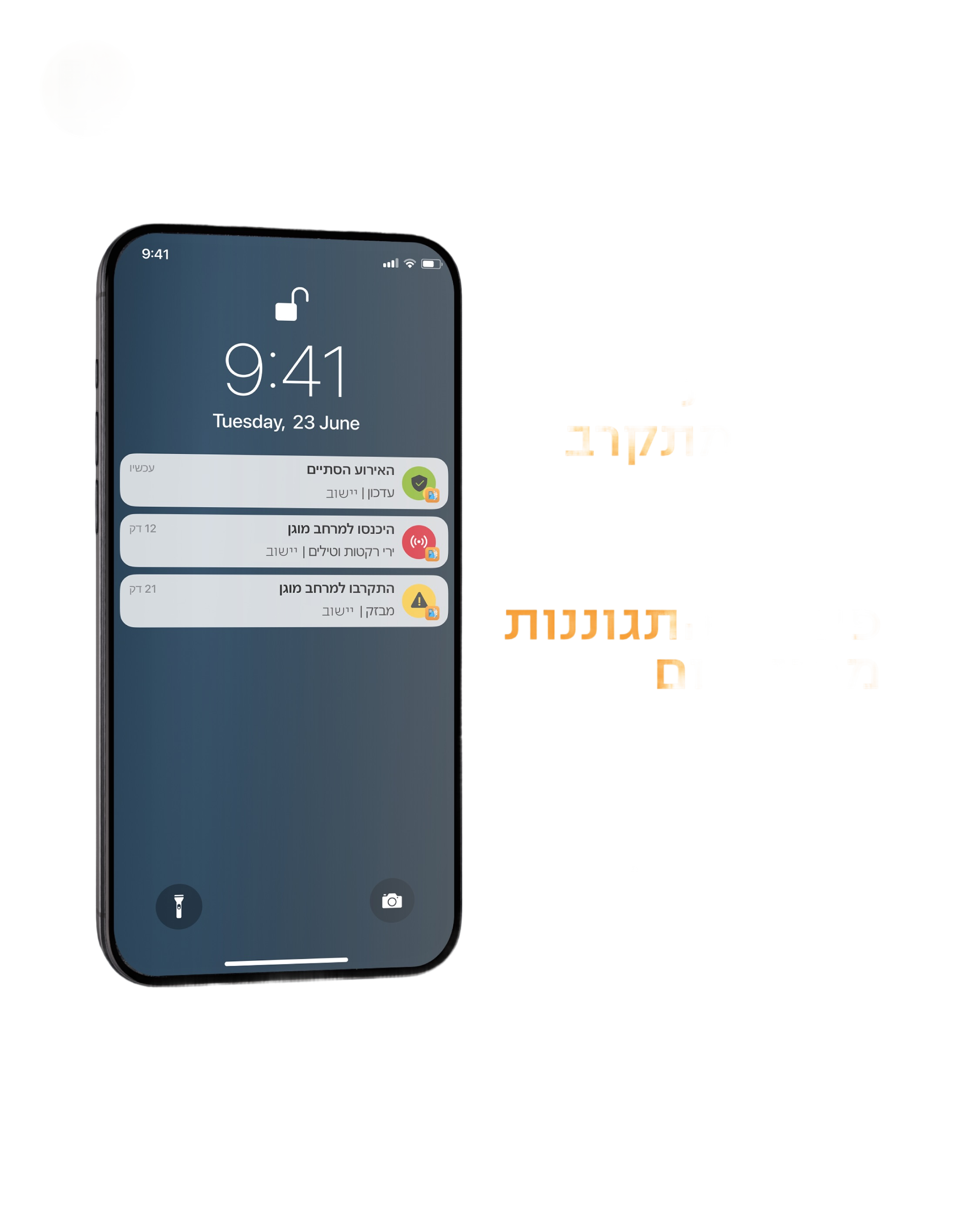
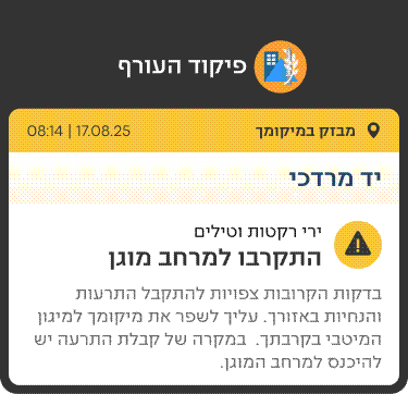
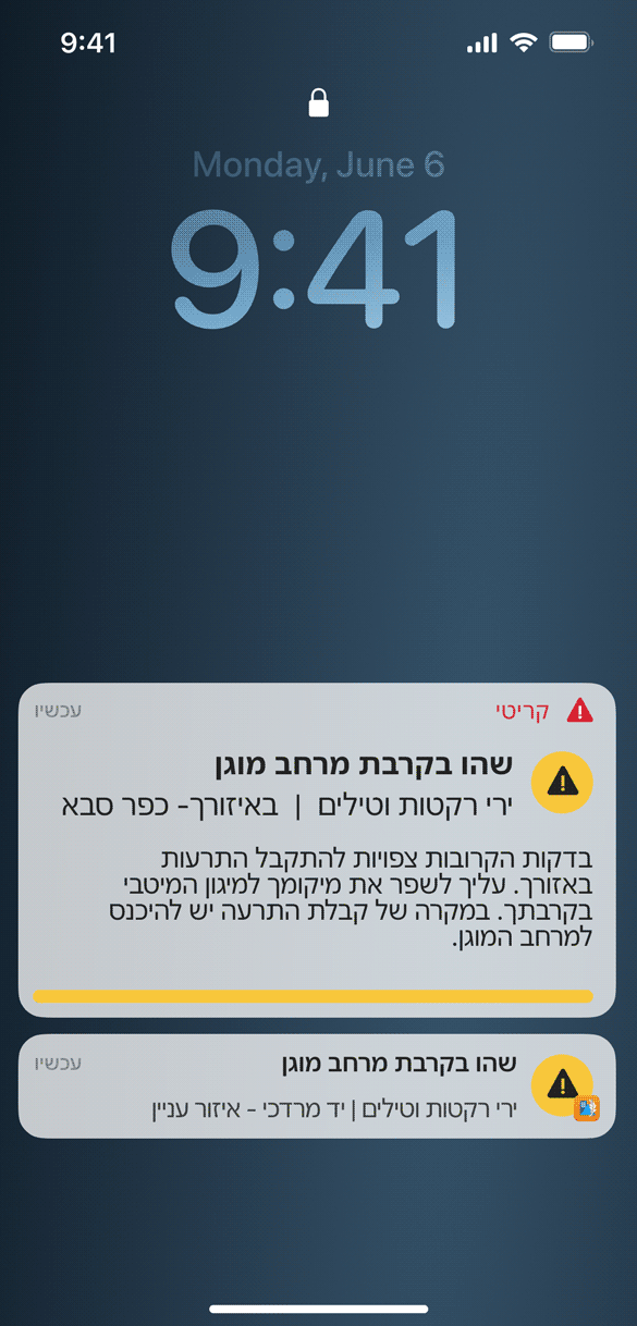
The old notification looked the same. Users had to read to understand what this notification means.
The redesign applied the full design system to the lock screen: smart icons that communicate threat type and location status instantly, color and sound per state, and copy refined to the minimum words needed to act.
The most deliberate decision was the hierarchy. An alert at your location and an alert in a favorite location produce completely different states of mind. One means move now. The other means someone I care about might be in danger. We matched the visual hierarchy to those emotional states and not just what the app is reporting, but what the user is actually feeling.
lock screen Notifications
Before
After
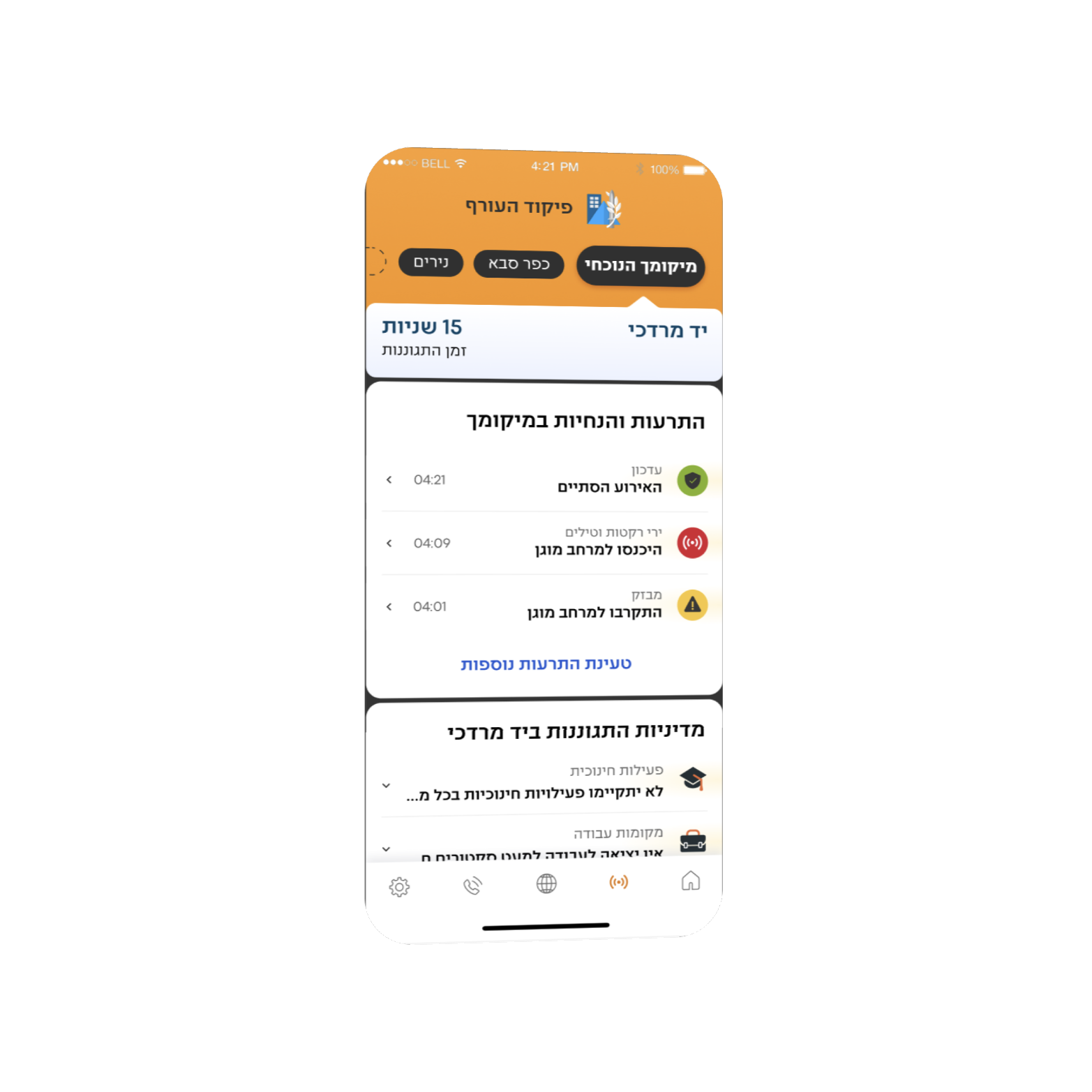
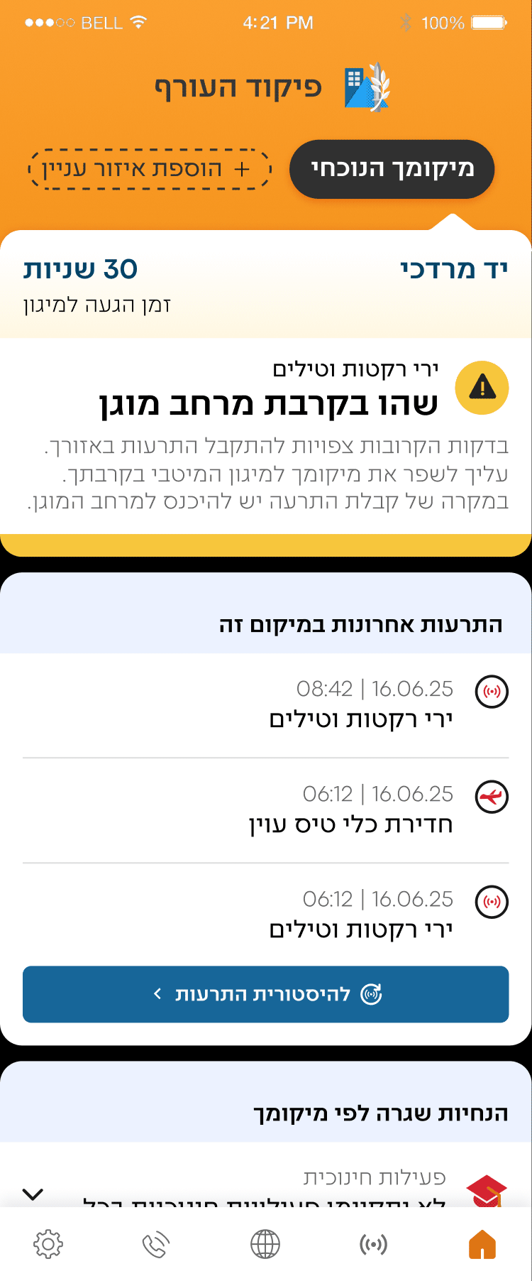
The alert screen
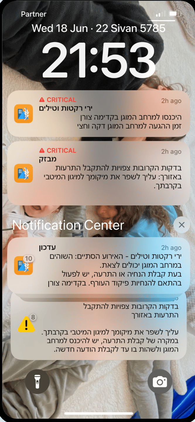
One persistent, prominent answer to the question people always asked: am I safe right now?
We created a defined niche for every single piece of information helping users easely reach the information they need. All clear, each visually distinct, each requiring zero interpretation.
Active alert → immediate, unmissable. All clear → green. "Safe to exit." For the first time, you could open the app and know, in under a second, whether you could leave the shelter.
THE MOMENT OF TRUTH
You can test a design a hundred times. You can't test it for real until it's real.
The app launched in May 2026. For a few weeks, routine. Then came June 8th.
Iran and Yemen. Coordinated attack. Sirens across multiple regions. Millions of phones going off simultaneously. And millions of people opening the new interface for the first time.
I won't pretend I was calm.
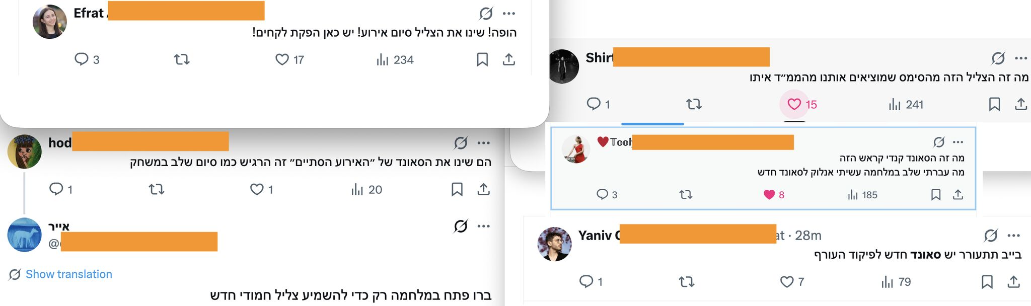
The reactions weren't just about volume. They were about what people said. They weren't describing a usability improvement. They were describing an emotional experience.
"Light, rhythmic. I loved it."
Someone who'd just spent time in a shelter during a missile attack used the word "loved" to describe a design element. That's not a UX win. That's something bigger.
WHAT'S NEXT?
The features launched are only the beginning.
During active conflict, GPS signals can be disrupted. For a location-based alert app, that's a critical failure point — users stop receiving the alerts most relevant to them at exactly the moment they need them most.
Smart Location Tracking lets users manually set an address or landmark as their primary location. Alerts for that location are treated with the same urgency and hierarchy as a live GPS alert. No signal needed. No gaps in coverage
Manual Location
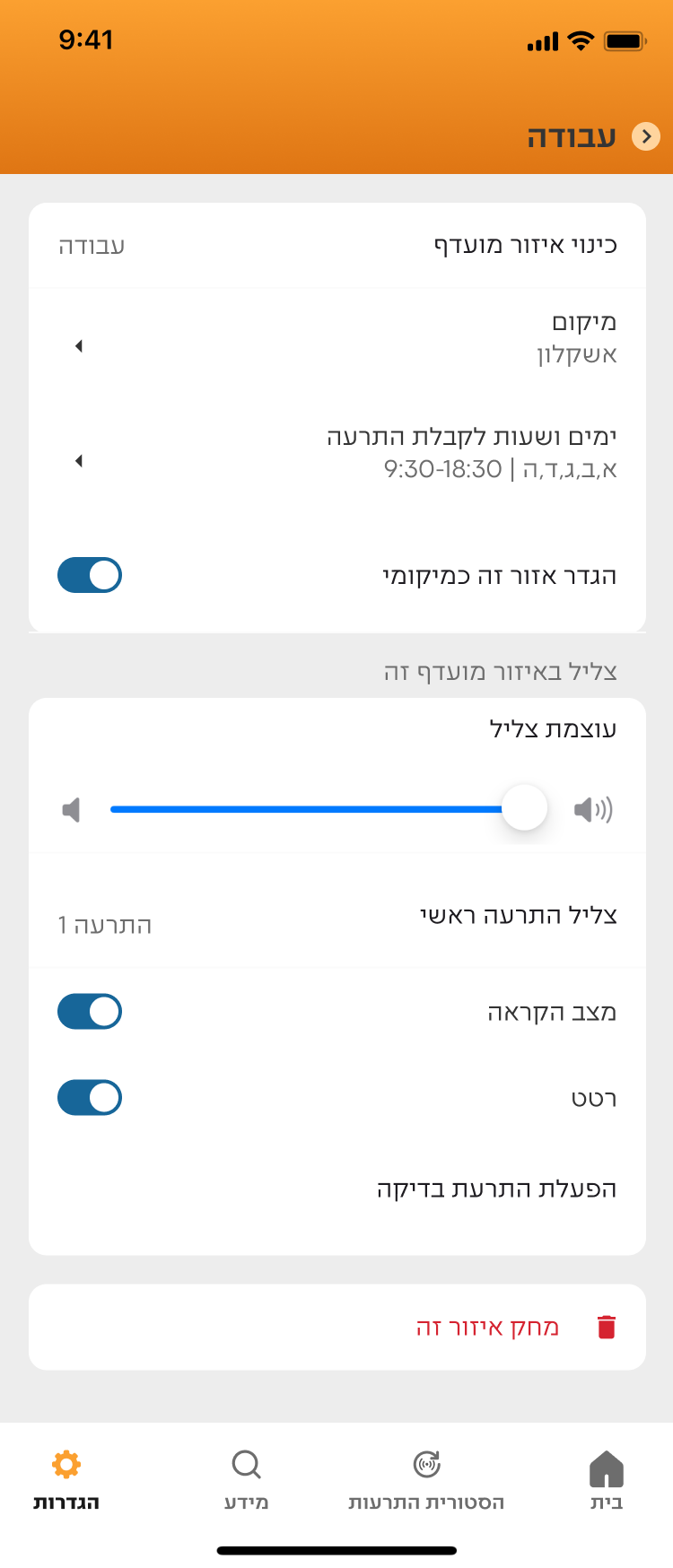
As mentioned before, our users are higly diversed users in wildly different contexts. each of them needs the app to behave differently without compromising their safety.
Smart Alerting Modes lets users configure notifications to fit their situation. Sleeping in a Shelter silences non-critical alerts through the night while keeping essential warnings live. Shabbat Mode keeps the screen permanently on, activates audio automatically, and displays a focused screen requiring no interaction.
One deliberate constraint: configuration applies only to favorite location alerts, never GPS-based ones. Because we're designing for the human factor — and a person should never be able to accidentally silence the alert that's about them, right now.
Customize Configuration and smart alerting modes
One persistent, prominent answer to the question people always asked: what's the status?
We redesigned the home screen around three states: prepare, act, and all clear. Each is visually distinct and requires zero interpretation.
home screen during alert
A live activity notification for your location, persistent on the lock screen, keeps your status clear. Favorite locations are maintained stacked, grouped, and clearly secondary.
Alert sounds will also have the option to be read aloud using three pieces of information: "Kfar Saba, enter protected space, missile attack." This provides a solution for users observing religious restrictions.
Live Activity notification and tTS Sound
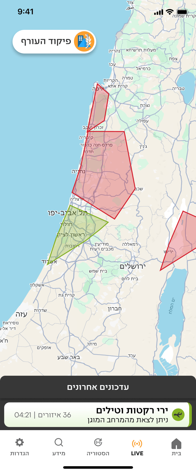
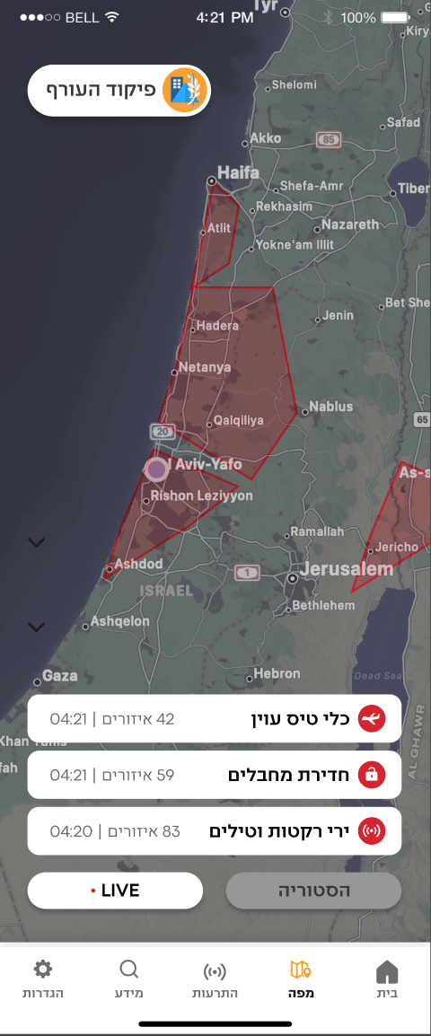
live map
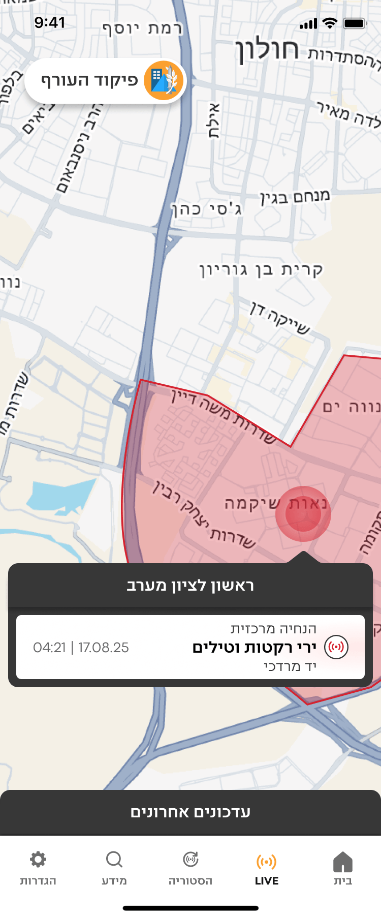
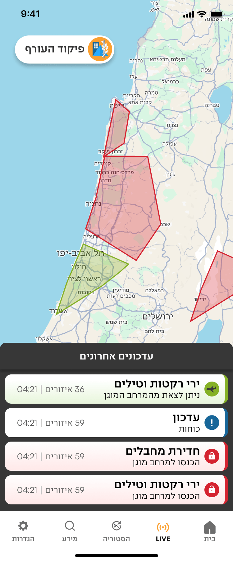
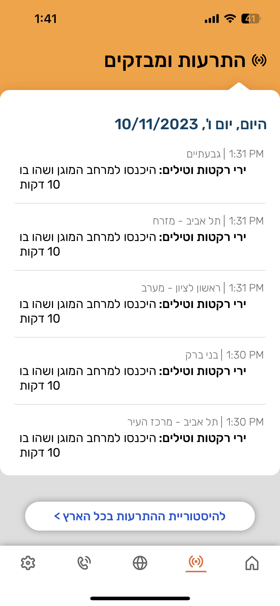
Real-time geographic display of active alerts, integrated across mobile and television broadcasts. Notifications answer: what do I do? The map answers: what is happening, and where?
Somewhere, a grandmother sheltered during a missile attack heard a light, rhythmic sound — and felt safe enough to stay calm.
That's not a UX win. That's a life-safety decision.
It's 6:00 AM. Your phone screams.
You have 15 to 90 seconds to reach safety. You fumble for your phone, eyes heavy, heart already hammering. In that moment all you need is instant clarity: What do I do right now?That was the design challenge, and for too long the app hadn't been clear enough to solve it.
On June 8th, 2026, missiles from Iran and Yemen targeted Israel. Millions turned to their screens.
The redesigned app, which had launched just weeks earlier, faced its first true test.
Suddenly the conversation took an unexpected twist. The news wasn't just reporting on the attack, they were reporting the app’s new interface. Within hours, the redesign was trending across every major news outlet and social media platform in the country, recognized not only for its aesthetics, but for its life-saving utility.
We weren't trying to go viral. We were trying to solve a problem.
The reactions told us we'd gotten something right.
So why did it land?
The old app worked.
7M+ users, alerts went out, people went to shelters, lives were saved. But high usage in a mandatory-download app doesn't tell you much about the experience. People used it because they had to, not because it was effortless.
A mother who just got her baby to sleep, a religious person on Shabbat, a 9-year-old student during class. They are all opening the same interface, in the same window of seconds, in wildly different contexts.
Small UX friction that's invisible in everyday apps becomes consequential when seconds matter. For the first time, the design met users where they actually were.

THE RESEARCH
We didn't assume. We asked.
Before touching a single screen, I ran comprehensive user surveys and focus groups. Some findings confirmed our hypotheses. One genuinely surprised us.Four patterns surfaced across every user group:
No distinction between act now and FYI.
Those wasted seconds reading are seconds not spent moving toward safety.
Safe notification felt as alarming as the alert. Same sonic language. No emotional shift.
The notification and lock screen looked identical whether an alert was active or resolved.
Confirmed
Notification hierarchy confusion was universal. Threat-type clarity was hardest for older users and new immigrants.
Surprised us
The sound problem was physiological, not just UX. After a siren, the body is flooded with cortisol . The all-clear was registering as another threat signal, not a release. That single insight rewrote our approach to sound design entirely.
Shaped the whole project
The accessibility constraints were far wider than expected — Shabbat observance, hearing impairment, people driving, families sleeping in shelters for days. Not edge cases. Significant portions of the user base.
Looking across all four patterns, one theme emerged:
the app required reading. Reading creates friction, and friction isn't good enough.
Under stress, users needs quick certainty.
THE SOLUTIONS
What will reduce friction for this person, in this exact moment?
Every solution was born from that one question.
Before touching a single screen, we needed to address the reading friction at its root.
Is a picture worth a thousand words? Maybe. But in our case, it only needed to be worth 21, the average length of our previous notification. Knowing that visuals are processed faster than text, we built a comprehensive design system that lets users reach certainty before they read a single word, and when we used words, the cleanest terminology possible.
Each state received a dedicated color and sound to differentiate it.
All content was refined to the minimum.
Alerts are expected in the next few minutes. Find the best protection around. When receiving an alert, enter the protected space until further notice

Get closer to Protected Space
We created smart icons that combine an indication of both the threat type and whether it occurs within the user's location or a saved favorite location.
Earthquake
Unmanned aerial vehicle
Tsunami
Your Location


Favorite Location


Every color is paired with a dedicated icon and sound: three simultaneous signals that work independently. If your phone is face down, the sound tells you. If you're in a noisy environment, the color and icon tell you. No single channel has to carry all the weight.
We built this into a component library, reusable across every screen, every platform, every state, every future feature.
The old notification looked the same. Users had to read to understand what this notification means.
The redesign applied the full design system to the lock screen: smart icons that communicate threat type and location status instantly, color and sound per state, and copy refined to the minimum words needed to act.
The most deliberate decision was the hierarchy. An alert at your location and an alert in a favorite location produce completely different states of mind. One means move now. The other means someone I care about might be in danger. We matched the visual hierarchy to those emotional states and not just what the app is reporting, but what the user is actually feeling.
lock screen Notifications
Before
After
The alert screen
The alert screen is where the design system and hierarchy come together fully. Every piece of information has a defined place: mandatory information leads, additional context follows. Users always know where to find what they're looking for, whether they need to act immediately or want to understand the full picture.
The K.I.S.S copy stripped the notification to what's needed to move. The alert screen holds everything we removed, but organized so it never creates friction. Nothing is hidden. Nothing competes.
THE MOMENT OF TRUTH
You can test a design a hundred times.
You can't test it for real until it's real.
The app launched in May 2026. For a few weeks, routine. Then came June 8th.
Iran and Yemen. Coordinated attack. Sirens across multiple regions. Millions of phones going off simultaneously. And millions of people opening the new interface for the first time.
I won't pretend I was calm.
The reactions weren't just about volume. They were about what people said. They weren't describing a usability improvement. They were describing an emotional experience.
"Light, rhythmic. I loved it."
Someone who'd just spent time in a shelter during a missile attack used the word "loved" to describe a design element. That's not a UX win. That's something bigger.
WHAT'S NEXT?
The features launched are only the beginning.
During active conflict, GPS signals can be disrupted. For a location-based alert app, that's a critical failure point — users stop receiving the alerts most relevant to them at exactly the moment they need them most.
Smart Location Tracking lets users manually set an address or landmark as their primary location. Alerts for that location are treated with the same urgency and hierarchy as a live GPS alert. No signal needed. No gaps in coverage
Smart Location Tracking
As mentioned before, our users are highly diverse and can be found in wildly different contexts. Each of them needs the app to behave differently without compromising their safety.
Smart Alerting Modes lets users configure notifications to fit their situation. Sleeping in a Shelter silences non-critical alerts through the night while keeping essential warnings live. Shabbat Mode keeps the screen permanently on, activates audio automatically, and displays a focused screen requiring no interaction.
One deliberate constraint: configuration applies only to favorite location alerts, never GPS-based ones. Because we're designing for the human factor — and a person should never be able to accidentally silence the alert that's about them, right now.
Customize Configuration and smart alerting modes
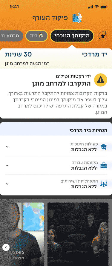
One persistent, prominent answer to the question people always asked: what's the status?
We redesigned the home screen around three states: prepare, act, and all clear. Each is visually distinct and requires zero interpretation.
home screen during alert

עבודה
סבתא רבקה
🏠 בית
מיקומך הנוכחי


30 שניות
זמן הגעה למרחב מוגן
יד מרדכי
ירי רקטות וטילים
יש להיכנס למרחב מוגן

היכנסו מיד למרחב המוגן ולשהות בו עד לקבלת הודעה חדשה. בעת קבלת התרעה אין לצאת מהמרחב המוגן גם לא בחלוף 10 דקות. שימו לב! יציאה מהמרחב המוגן תתאפשר לאחר קבלת הנחייה מפורשת.
יד מרדכי
הנחיות ב

פעילות חינוכית
ללא הגבלות


מקומות עבודה
ללא הגבלות

התקהלויות ושירותים
ללא הגבלות

לורם איפסום דולור סיט אמט, קונסקטורר אדיפיסינג
לורם איפסום דולור סיט אמט, קונסקטורר אדיפיסינג
לורם איפסום דולור סיט אמט, קונסקטורר אדיפיסינג
לורם איפסום דולור סיט אמט, קונסקטורר אדיפיסינג
מה עושים בעת קבלת התרעה בזמן נהיגה?
מקום טוב באמצע


9:41

הגדרות

מידע

הסטורית התרעות

בית
A live activity notification for your location, persistent on the lock screen, keeps your status clear. Favorite locations are maintained stacked, grouped, and clearly secondary.
Alert sounds will also have the option to be read aloud using three pieces of information: "Kfar Saba, enter protected space, missile attack." This provides a solution for users observing religious restrictions.
Live Activity notification and tTS Sound
live map
Real-time geographic display of active alerts, integrated across mobile and television broadcasts. Notifications answer: what do I do? The map answers: what is happening, and where?
Somewhere, a grandmother sheltered during a missile attack heard a light, rhythmic sound — and felt safe enough to stay calm.
That's not a UX win. That's a life-safety decision.